🎨 Vastu Guide · Colours

Vastu colours for each room

In Vastu, colour carries the energy of the five elements + the directions — so the right palette per room is said to support its purpose. Here's the genuine room-by-room Vastu colour guide, translated into modern, livable palettes that suit Tamil Nadu homes.

By Kavya Gayathri, Founder & Lead Designer, Homeli · Chennai · Updated May 2026

Get free material consultation → Cost calculator
Vastu colours for each room Tamil Nadu
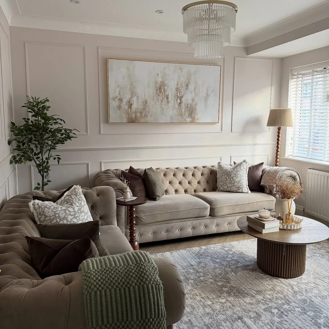
Vastu-aligned colours, styled for a modern Tamil Nadu home (illustrative)

Direction + element colour map

DirectionElementFavoured colours
North-EastWaterWhite, light blue
EastAirWhite, light green, pastels
South-EastFireWarm tones used sparingly (not whole walls)
South-WestEarthBeige, brown, earthy tones
NorthWater/WealthGreen, light blue
WestSpaceWhite, grey, neutrals

Room-by-room palette

RoomVastu-aligned colours
Master bedroomSoft earthy tones, beige, muted rose, light blue
Children's roomCalm green, light blue, soft neutrals
KitchenWhite, soft yellow, warm cream (avoid heavy black)
Pooja roomWhite, cream, soft yellow, light wood
Living roomLight green, beige, neutral with warm accents
BathroomWhite, light grey, soft pastels

Practical colour notes

  • Favour light, soothing tones on large surfaces; use bold/dark colours as accents, not full walls
  • Vastu generally advises restraint with heavy black + intense red on big surfaces
  • White + pastels in the North-East keep that sacred zone light
Kavya's take: I treat Vastu colour as a gentle guide, not a cage. The core idea — light, soothing tones on the big walls + bold colours as accents — is exactly how good interior design works anyway. So we honour the directional palette where a client values it (earthy master bedroom, light NE pooja, calm kids' room) while keeping the home looking current + cohesive, never dated. Vastu colours + great design coexist easily.

The verdict

Vastu maps colours to directions + elements: light blues + whites for the water-ruled North-East, earthy beige/brown for the South-West, greens for the North, and warm tones used sparingly in the fire-ruled South-East. Room by room, lean on soft, soothing palettes (earthy bedrooms, light pooja + kids' rooms, calm living spaces) with bold colours as accents — guidance that sits comfortably inside modern, cohesive interior design for Tamil Nadu homes.

Not sure which material is right for your home?

Tell us your project and budget. A senior Homeli designer will recommend the right materials for your space and Chennai's climate — free, no obligation.

  • Free material + design consultation
  • Honest, brand-named recommendations
  • Real 2026 Chennai pricing
  • Marine-grade specs for coastal localities
Get free material advice
Senior advisor responds within 4 working hours. No spam.

Common questions

What are the best Vastu colours for each room?
Master bedroom: earthy beige/muted tones; children's room: calm green/light blue; kitchen: white/cream/soft yellow; pooja: white/cream/light wood; living: light green/beige with warm accents; bathroom: white/light grey/pastels. The theme is soft, soothing tones with bold colours as accents.
What colour is good for the North-East as per Vastu?
White + light blue — the North-East is ruled by the water element + is the sacred zone, so light, clean colours keep it pure + bright. This applies to a pooja room or any space in the home's NE.
Which colours should be avoided in Vastu?
Vastu generally advises restraint with heavy black + intense red on large surfaces (they're considered over-stimulating or heavy). They're better used as small accents. The broad principle is light, soothing tones on big walls.
What colour is best for a Vastu bedroom?
Soft, earthy tones — beige, light brown, muted rose, gentle light blue — for the master bedroom, supporting rest + calm. Avoid intense reds + heavy dark colours on full walls; use them as small accents if desired.
What colours suit a Vastu kitchen?
White, soft yellow + warm cream suit the kitchen, keeping it bright + clean. Vastu advises against heavy black on large kitchen surfaces. Warm accent tones are fine, in keeping with the South-East fire element used in moderation.
Do Vastu colours clash with modern interior design?
Rarely — the core Vastu colour idea (soft, soothing tones on big surfaces + bold colours as accents) is exactly how good modern design works. We honour the directional palette where you value it while keeping the home current + cohesive; the two coexist easily.
Can I use dark or bold colours at all?
Yes — as accents, not full large surfaces. A bold feature wall, cushions, or decor in a deeper tone is fine + adds character. Vastu's caution is mainly about heavy black/intense red dominating big surfaces, not about avoiding colour entirely.
How does Homeli apply Vastu colours?
We treat Vastu colour as a gentle guide: light, soothing palettes per room (earthy bedrooms, light NE pooja, calm kids' + living spaces) with bold colours as accents. We honour the directional scheme where you value it while keeping the design modern + cohesive — confirmed on your mood board.

Related material guides