Colour affects how your brain responds to a space — this is scientifically proven, not just interior design intuition. In a bedroom, where the goal is rest and recovery, the right colour choice can meaningfully improve sleep quality. Here's what science and Vastu both agree on, with 8 ready-to-use palettes.
What Sleep Science Says
Research consistently shows that blue, soft green, grey, lavender, and warm neutral tones reduce heart rate, lower blood pressure, and reduce cortisol (the stress hormone) — all factors that support deeper, faster sleep onset. Stimulating colours — red, bright orange, vivid yellow — have the opposite effect: they increase alertness and make it harder to wind down.
The brain perceives cool colours as calming (reminiscent of sky, sea, nature) and warm saturated colours as energising (reminiscent of fire, danger, excitement). In a bedroom, calming is always the goal.
What Vastu Says
Vastu Shastra recommends these colours for master bedrooms: light pink, cream, pale peach, warm beige, and pale green. These are described as promoting harmony, affection, and restorative sleep. Vastu recommends against red, bright orange, and dark maroon for bedrooms — interestingly aligned with sleep science.
Direction also matters: south-west facing master bedrooms (recommended in Vastu) benefit from earthy, warm tones. North-east facing rooms should use lighter, cooler tones.
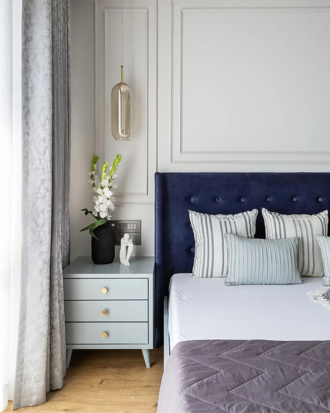
8 Calming Bedroom Palettes
1. Soft Blue + Cream
The highest-rated sleep palette globally. Soft blue walls, cream ceiling and trim, natural wood accents. Very calming and spacious-feeling.
2. Sage Green + Warm White
Soft sage green on three walls, warm white on ceiling. Reminiscent of a forest glade. Deeply calming and naturally grounding.
3. Warm Grey + Sand
Warm greige walls with sandy beige accents. Utterly unstimulating — the perfect neutral canvas for a restful bedroom.
4. Dusty Lavender + Cream
Soft lavender on the headboard wall only, cream on three walls. Research-backed for sleep. Particularly effective for people with anxiety.
5. Warm Peach + Linen
Very Indian and Vastu-aligned. Pale peach walls with linen-coloured ceiling and teak accents. Warm and comforting without being stimulating.
6. Muted Green + Terracotta Accent
Muted, dusty green on headboard wall, warm cream on three walls with terracotta accents in textiles. Sophisticated earthy combination.
7. Mushroom Brown + Off-White
The 2024 favourite — dusty mushroom brown with off-white. Deeply grounded, sophisticated, and extremely restful. Works in any room orientation.
8. Slate Blue + Pale Mint
A cooler combination for rooms that run warm. Pale slate blue on headboard wall with mint-tinted white on other walls. Very soothing and sleep-positive.
Colours to Avoid in Bedrooms
- Red and bright orange: Proven to increase heart rate — the worst sleep colours
- Vivid yellow: Energising and alertness-inducing, excellent for kitchens but disruptive in bedrooms
- Bright white: Creates glare and feels cold/clinical in India's natural light
- Very dark brown or near-black: Can feel oppressive in a closed bedroom without good lighting
Accent Wall Placement
The wall behind the headboard is the natural accent wall in a bedroom. A slightly deeper version of your main colour (or a complementary dark tone) on this one wall creates depth and beautifully frames the bed. Keep the other three walls lighter. Do not accent the wall opposite the bed — it's the first thing you see when waking and should be calm, not demanding attention.
Paint Finish for Bedrooms
Eggshell or soft sheen finish is the best choice for bedroom walls. It offers a subtle low-gloss that reflects light gently, is slightly washable (important near the headboard wall), and hides minor wall imperfections better than flat matt paint. Avoid high-gloss in bedrooms — it creates uncomfortable reflections when lying down with low lighting. The ceiling should always be flat white.
Want a bedroom colour recommendation for your home?
Homeli's designers consider room orientation, natural light, and your existing furniture to recommend the perfect palette. Free for Chennai homeowners.
Get Free Bedroom Colour Advice →Frequently Asked Questions
Also read: Master Bedroom Design Ideas · Living Room Colour Combinations · Interior Designers in Chennai